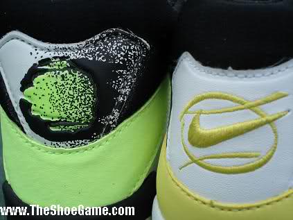
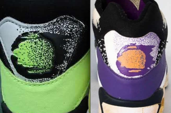
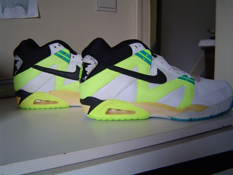
Its hard to believe that its been 5 years since one if not the worst retro to date was released, the Nike Tech Challenge III Retro. Sales were horrible, and justifiably so. When you cut major corners with an iconic shoe such as the Tech Challenge III things aren’t going to pan out. For one, the bright neon green was substituted for a bland yellow. The black heel strip was left unpainted (it looks almost as if it were a mistake), and the biggest change? The beloved flaming tennis ball logo was gone, rather, substituted for an extremely generic embroidery. The purple color way was just as bad if not worse. In addition to the black heel strip being abondoned, they painted the area around the air bubble purple, ditched the splatter paint which spread up to the collar as well as the speckle print towards the front of the midsole. To sum it up, it was quite possibly the laziest attempt at a retro EVER.
Now, if you would like to see a CORRECT retro of the Nike Tech Challenge make sure and VOTE BELOW as well as JOIN THE FACEBOOK PAGE!
SPECIAL SHOUT OUT TO THESHOEGAME.COM for providing some comparison pics. Please note, their comparison pics are between a youth size (mens size looks a little different).
SUMMARY TO NIKE: KEEP THE NEON GREEN, HEEL STRIP SHOULD BE BLACK, FLAMING TENNIS BALL SHOULD BE ON BACK. THE PURPLE COLORWAY SHOULD HAVE THE SAME BLACK STRIP AND THE WHITE DESIGN AROUND THE BLACK COLAR, WITH NO PURPLE PAINT AROUND THE AIR UNIT AND SPECKLE PAINT TOWARDS THE FRONT OF THE SHOE.


